I recently worked on a quick project for our local Cub Scouts Pack, and it rekindled my desire to update my own website. Which, as a designer means I’m also going to work on a new logo for myself, because why not?

So here we are…a new Letter 10 logo paying homage to my native heritage and a subtle “m” showing up in the feather. Nothing more, nothing less.
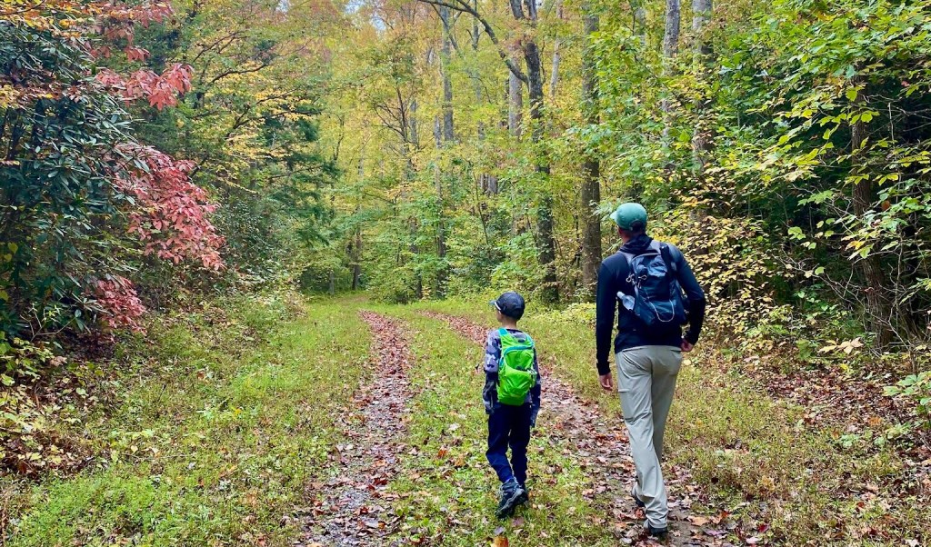
My plan for the site is to make it more about my attempts at maintaining the balance between work and life. It’s tricky for all of us, I think it is getting even more tricky after the past couple of years dealing with the pandemic. I also find it challenging when you work remotely like I do. It is easy to get pulled into work more frequently, and it is equally as easy to get pulled into life at any time. The flexibility is a blessing and a curse.
I go through these waves…when I want to write more, or post more, or utilize different social channels for different reasons. I guess it is part of being in the industry, and having things intersect so often as I try to find this elusive balance. So here I am…in the window of time where I want to post more. I will likely post about some things I’ve done over the past couple of years to play a bit of catch up on the timeline. I have some OCD about the continuity of things, so it’s my burden to fill in the gaps. I also think I will start writing some reviews of things as my hobbies expand.
Let’s see how consistent I can become…or inconsistent. And I hope you enjoy where it heads. If not, I’m sure it will meander a new direction in the future, so just wait a while and see what turn comes next!
